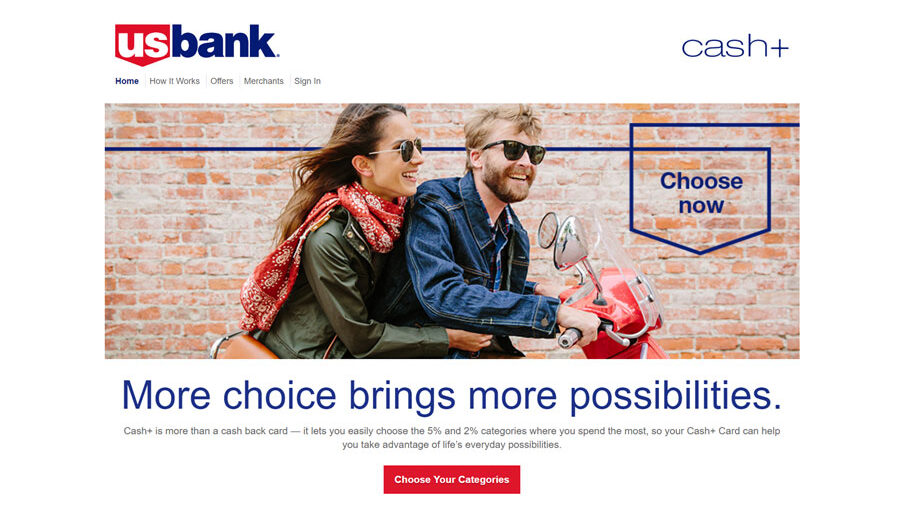
US Bank Cash+ Rewards
Interactive Customer Experience

Project Overview
U.S. Bank’s Cash+ rewards program was designed to increase cardholder engagement by allowing customers to earn rewards in categories that aligned with their spending habits. The challenge was helping customers understand, explore, and actively participate in a program that offered meaningful flexibility without overwhelming them with complexity.
The platform needed to communicate a substantial amount of information regarding rewards categories, benefit selection, earning structures, and account participation while maintaining customer attention throughout the experience. Traditional financial product pages often struggle under the weight of explanatory content, creating experiences that feel more educational than engaging.
The goal was to create a rewards experience that felt approachable, interactive, and genuinely enjoyable to use while still helping users make informed decisions about their benefits. The resulting platform combined customer education, engagement, and self-service functionality within a highly interactive experience designed to encourage ongoing participation in the Cash+ program.
Key Challenges & Solutions
Making Rewards Selection Feel Approachable
Cash+ offered customers meaningful control over their rewards categories, but that flexibility introduced complexity. Users needed to understand available options, compare categories, and make selections confidently without feeling like they were navigating a financial product configuration tool.
The solution focused on turning benefit selection into a guided interactive experience rather than a static information page. Information was broken into manageable pieces, and interaction patterns were used to make category exploration feel intuitive and engaging.
Presenting Complex Information Without Losing Attention
The rewards program required communicating a significant amount of information about categories, eligibility, participation, and account benefits.
Rather than relying on dense blocks of content, the experience used interactive elements to progressively reveal information and encourage exploration. This helped maintain user engagement while still delivering the detail required for informed decision-making.
Translating Desktop Interaction Models to Mobile Devices
One of the most technically challenging aspects of the project involved adapting a drag-and-drop benefit selection interface for mobile users.
The original design concepts focused heavily on desktop interaction patterns. Mobile-specific behavior needed to be designed and implemented in a way that preserved the intuitive nature of the experience while accounting for the realities of touch interaction and smaller screen sizes.
The final implementation translated the intent of the original interaction model into a mobile-friendly experience that remained easy to understand and use across devices.
Balancing Utility With Entertainment
Financial services interfaces often prioritize functionality at the expense of engagement. The challenge was creating an experience that remained useful and informative while also feeling enjoyable enough to encourage participation.
Interactive elements, animation, and responsive feedback mechanisms were incorporated thoughtfully to make the experience feel more dynamic without distracting from the core task of benefit selection and rewards education.
The Work
Interactive Benefit Selection Experience
The centerpiece of the project was a highly interactive benefit chooser that allowed users to explore and select rewards categories through direct interaction rather than traditional form-based workflows.
The experience transformed what could have been a routine account-management task into something more engaging while still preserving clarity and usability.
Mobile Interaction Design & Development
A significant portion of the implementation focused on extending the original desktop interaction concepts into a cohesive mobile experience.
Touch-friendly behaviors, responsive layouts, and alternative interaction patterns were developed to ensure that benefit selection remained intuitive regardless of device.
Customer Education Through Interaction
The platform was designed to teach users about the rewards program while they actively engaged with it.
Rather than separating education from action, information was integrated directly into the user journey, helping customers learn about their options as they made selections.
Responsive Front-End Development
The experience was refined across multiple screen sizes and device types to ensure consistency in usability, interaction behavior, and visual presentation throughout the platform.
Feature Highlights
Interactive Rewards Category Selection
A dynamic benefit chooser transformed category selection from a traditional form process into a more engaging customer experience.
Mobile-Adapted Drag-and-Drop UX
Desktop interaction concepts were successfully translated into intuitive touch-friendly experiences for mobile users.
Engagement-Focused Financial UX
Interactive design patterns helped maintain attention while communicating complex rewards information.
Educational Customer Journey
Program education and account interaction were combined into a single integrated experience.
Outcome
The finished platform helped make participation in the Cash+ rewards program more approachable, engaging, and intuitive for cardholders.
By combining customer education with interactive benefit selection, the experience encouraged users to actively engage with their rewards options rather than passively consume information about them. The result was a digital experience that balanced financial utility with thoughtful interaction design while supporting the broader goal of increasing customer participation in the program.
More importantly, the project demonstrated how complex financial products can be communicated through interaction-driven experiences that make learning and decision-making feel more natural, engaging, and user-focused.